30 ways to improve motivation of webdesigners
May 2, 2025
6 Best website builder for small business
May 4, 2025Common Blunders in typography Design
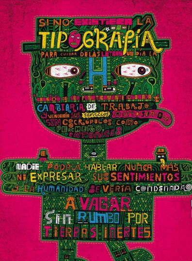
Web is informative, information convey through letters. But without understanding the color, size, font face of those letters it might be meaningless or cannot make deep psychological impact on our mind. Hence the concept of typography is derived. Now we are considering an example to understand it in better way. Suppose we have a piece of text which denote the heading of a paragraph so if we don’t make it in bold, larger in font size it will be meaningless or cannot drag us towards that piece of text. This is the significance of proper typography. But typography is not only related to font size, font face , color but beyond that. Blunders in typography Design is some typographic mistake that most designer makes.
Using too many different fonts in one document
When I worked in a company one of my colleague had made this once,used too many fonts in single webpage. When i asked him he said it would illuminate the tiresome text to some extent, but after a long debate with him on this issue he was not convinced to remove it.Ultimately when client saw this he rejected that design and the logic behind that it was too annoying to read.So as far as font is concern use at most two fonts in your assignment.
Bad color choices is the other blunders in typography
The main concern of typography is to maintain a good readability of your text.But sometimes bad color choices can harm or hamper this process.Like if you consider the same background color and text color it will be much difficult for visitor to read this out.Sometime you can choose different color contrast for background and text , but due to wrong choices it can make your visitors’ eyes uncomfortable.So the contrast should be chosen in a such manner as if it will give pleasure to visitors’ eyes.
Centering text
Centering a text emphasize on purpose ,but some people are more addicted to use it anywhere without understanding its significance.If you consider to use it in your global style it will make your design a invitation card rather than anything else.
Decorative faces aren’t always beautiful
Decorative font face needs to be used in heading of any paragraph instead of use it for all the text,that could really hamper the readability.
Using capital letters all the time
Capital letters are generally being used to draw the attention of the readers.If we use it all the sections throughout the entire paragraph then it will be annoying for any reader to find out the important part of that content.
Using too much emphasis
You can make a word bold or italicized or underline to emphasize on that.But do not use all the three at the same time as it could lost its significance.
Not enough leading
The core purpose of the typography is to increase the readability of a large text.Leading is an important component which needs to be looked after. A paragraph with wrong leading will be very difficult for a reader to follow the lines and they can loose the place in between.
Not enough tracking
Tracking is related to the spacing of the letters.This could be as important as leading to improve the readability and can be use to maintain the flow of text.
Lengthy lines of text
Most designer do not know about the convention to keep the text length for a line should be kept in between 50-60 characters long.Lengthy line of text is very annoying for visitors’ eyes.This leads to move their heads and eyes more often that causes eyes’ fatigue.
Bad kerning
Kerning adjust the space between two letters.Sometimes designer overlook it or use bad kerning to make the typography meaningless.
To know More About Web Designing Visit :
Picture Credit:pixabay


